
Below is a pure HTML/CSS/JS example you can paste into a Custom HTML (or Custom Liquid) block in Shopify. It uses modern CSS (position: sticky) with a tiny helper script for polish (active line highlight, copy button, responsive top offset). Treat it as an example; change colors, fonts, and code as you like.
Where to paste in Shopify
- Online Store → Themes → Customize
- Open the template (Home or a custom page).
- Add section → Custom HTML (or Custom Liquid).
- Paste the entire snippet below.
- Save and preview.
Copy-Paste Example — Sticky on Scroll Hero
Paste everything from <!DOCTYPE html> to </html>.
DESIGNED FOR REFERENCE ONLY
Copy and paste into your theme, then adjust colors to match your brand.
<body>
<meta charset="UTF-8">
<meta name="viewport" content="width=device-width, initial-scale=1.0">
<title>Shopify Sticky on Scroll Hero</title>
<style>
:root{
/* Brand tokens — tweak these */
--hero-bg: #0f1115;
--hero-fg: #e8ecf1;
--accent: #00d084;
--muted: #93a0b4;
--card: #151924;
--radius: 14px;
--gap: 22px;
--sticky-top: 16px; /* sticky offset (desktop) */
--sticky-top-m: 8px; /* sticky offset (mobile) */
--code-bg: #0b0d12;
--code-fg: #e8ecf1;
--code-hl: #1c2435;
--shadow: 0 14px 40px rgba(0,0,0,.28);
}
/* Page base (demo) */
html,body{ margin:0; background:var(--hero-bg); color:var(--hero-fg); font-family: Arial, sans-serif; }
.container{ max-width:1200px; margin:0 auto; padding:32px 18px 70px; }
/* HERO LAYOUT */
.hero{
display:grid;
grid-template-columns: 1.1fr .9fr;
gap: var(--gap);
align-items: start;
min-height: 80vh;
}
.hero-left{
display:flex; flex-direction:column; gap:22px;
}
.kicker{ color: var(--accent); font-weight:800; letter-spacing:.4px; font-size:13px; text-transform: uppercase; }
.title{ font-size: clamp(28px, 5.4vw, 56px); line-height: 1.05; margin:4px 0 0; }
.sub{ color: var(--muted); font-size: clamp(14px, 2.2vw, 18px); max-width: 65ch; }
.cta-row{ display:flex; gap:12px; flex-wrap:wrap; }
.btn{
appearance:none; border:0; border-radius:10px; padding:12px 16px; cursor:pointer; font-weight:800;
background: var(--accent); color:#0f1115;
}
.btn--ghost{ background:transparent; color:var(--hero-fg); border:1px solid #2a3143; }
/* Long content to demonstrate scroll next to sticky code panel */
.hero-body{
display:flex; flex-direction:column; gap:18px; margin-top: 10px;
}
.hero-body p{ margin:0; color:#cfd7e3; }
.divider{ height:1px; background:#20283a; margin:6px 0 2px; opacity:.6; }
/* STICKY CODE CARD */
.code-card{
position: sticky;
top: var(--sticky-top);
background: var(--card);
border-radius: var(--radius);
box-shadow: var(--shadow);
overflow:hidden;
border:1px solid #1f2636;
}
.code-head{
display:flex; align-items:center; justify-content:space-between;
padding:12px 14px; background:#13192a; border-bottom:1px solid #1f2636;
}
.code-head .label{ font-weight:800; font-size:13px; letter-spacing:.2px; color:#cfd7e3; }
.code-head .tools{ display:flex; align-items:center; gap:8px; }
.pill{
padding:6px 10px; border-radius:999px; background:#1b2030; color:#cfd7e3; font-size:12px;
}
.copy-btn{
appearance:none; border:0; border-radius:8px; padding:8px 10px; cursor:pointer;
background: var(--accent); color:#0f1115; font-weight:800;
}
pre{
margin:0; max-height: 60vh; overflow:auto; background: var(--code-bg); color: var(--code-fg);
padding:16px; line-height:1.4; font-size:13px;
font-family: ui-monospace, SFMono-Regular, Menlo, Monaco, Consolas, "Liberation Mono","Courier New", monospace;
}
code{ white-space: pre; display:block; }
.line{ display:block; padding:2px 8px; border-radius:6px; }
.line.hl{ background: var(--code-hl); }
/* RESPONSIVE */
@media (max-width: 980px){
.hero{ grid-template-columns: 1fr; }
.code-card{ top: var(--sticky-top-m); }
}
/* Demo filler after hero to show the sticky dissolving as you scroll away */
.after{ margin-top:50px; padding:40px 0 140px; color:#cfd7e3; }
</style>
<div class="container">
<section class="hero" aria-label="Sticky on scroll hero">
<!-- LEFT: Scrolling content -->
<div class="hero-left">
<div class="kicker">Shopify UI Pattern</div>
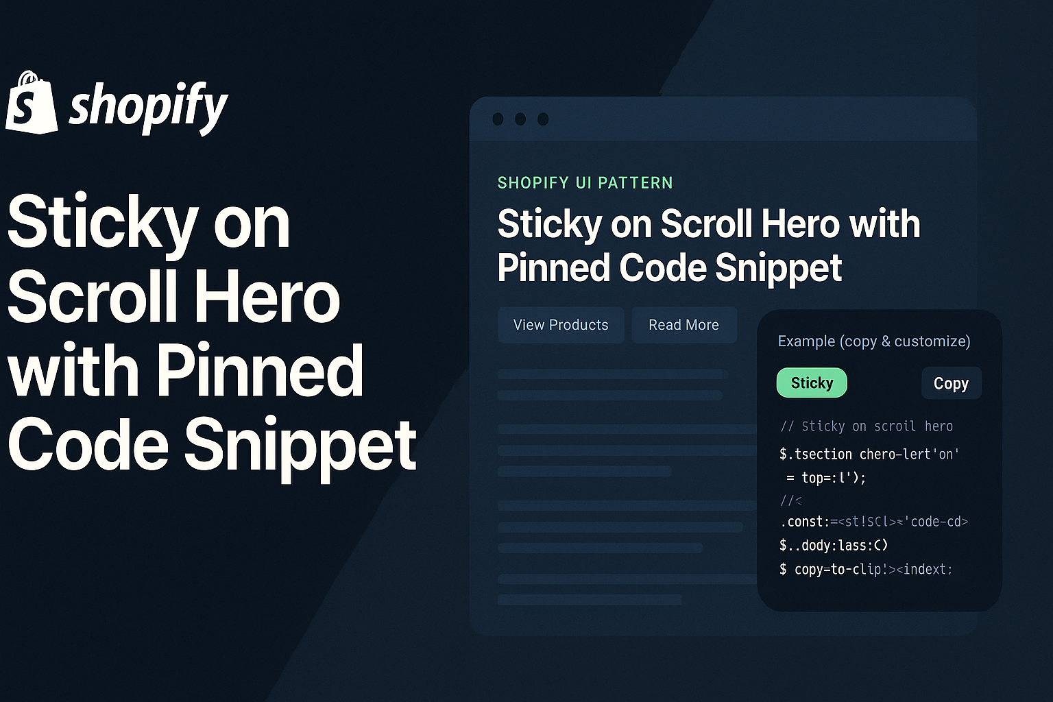
<h1 class="title">Sticky on Scroll Hero with Pinned Code Snippet</h1>
<p class="sub">Keep your most important element in view while supporting content flows beside it. Perfect for tutorials, product specs, or launch notes. The example below pins a code panel; you can pin promos, CTAs, or images just as easily.</p>
<div class="cta-row">
<button class="btn" onclick="window.location.href='/collections/all'">View Products</button>
<button class="btn btn--ghost" onclick="window.location.href='/pages/blog'">Read More</button>
</div>
<div class="hero-body">
<div class="divider"></div>
<p><strong>Why this pattern works:</strong> your eyes don’t have to travel back up to re-find the important action. The pinned panel is always there.</p>
<p>Use cases: promo code blocks, delivery notices, USP lists, or (like here) a code snippet learners can copy as they read.</p>
<p>Performance tip: native <code>position: sticky</code> avoids heavy scroll listeners; we only add a tiny script for niceties like line highlighting and copy-to-clipboard.</p>
<p>Accessibility: text remains selectable; keyboard users can tab to the copy button; color contrast is sufficient.</p>
<p>Below, we’ll keep adding paragraphs to simulate real content. On desktop, scroll and watch the code panel stay pinned with a subtle offset from the top. On mobile, it still pins with a smaller offset so it doesn’t overwhelm the viewport height.</p>
<p>Customize the top offset via CSS variables <code>--sticky-top</code> and <code>--sticky-top-m</code>. If your theme header is sticky, increase the offset to avoid overlap.</p>
<p>When the hero ends, the sticky element will naturally “un-pin” as its container scrolls out—no special code needed.</p>
<p>Pro move: swap this code card for a promo/lead magnet box on campaign days. Same behavior, different content.</p>
<p>Okay, keep scrolling a little more to feel the behavior.</p>
<p>Almost there. 👇</p>
</div>
</div>
<!-- RIGHT: Sticky code panel -->
<aside class="code-card" id="stickyCard">
<div class="code-head">
<span class="label">Example (copy & customize)</span>
<div class="tools">
<span class="pill">Sticky</span>
<button class="copy-btn" id="copyBtn" aria-label="Copy code">Copy</button>
</div>
</div>
<pre aria-label="Code example"><code id="codeBlock">
<span class="line">// Sticky on scroll hero (HTML shell)</span>
<span class="line"><section class="hero"></span>
<span class="line"> <div class="hero-left">...long content...</div></span>
<span class="line"> <aside class="code-card" style="position:sticky;top:16px">...</aside></span>
<span class="line"></section></span>
<span class="line"></span>
<span class="line">// CSS: make the aside sticky and style the card</span>
<span class="line">.code-card{ position:sticky; top:16px; }</span>
<span class="line">.code-card pre{ max-height:60vh; overflow:auto; }</span>
<span class="line"></span>
<span class="line">// JS (optional): copy-to-clipboard</span>
<span class="line">navigator.clipboard.writeText('...your code...')</span>
</code></pre>
</aside>
</section>
<section class="after">
<h2>After the hero</h2>
<p>Once you scroll past the hero container, the sticky panel naturally stops sticking. That’s the beauty of native <code>position: sticky</code> — no heavy scroll math.</p>
</section>
</div>
<script>
(function(){
// Copy to clipboard
const copyBtn = document.getElementById('copyBtn');
const codeBlock = document.getElementById('codeBlock');
if(copyBtn && codeBlock){
copyBtn.addEventListener('click', async () => {
try{
const text = codeBlock.innerText.replace(/\u00A0/g, ' ');
await navigator.clipboard.writeText(text);
const prev = copyBtn.textContent;
copyBtn.textContent = 'Copied!';
setTimeout(()=> copyBtn.textContent = prev, 1200);
}catch(e){
copyBtn.textContent = 'Select & CMD/CTRL+C';
}
});
}
// Optional: Highlight the line that’s near the vertical center of the code viewport
const pre = document.querySelector('pre');
function highlightVisibleLine(){
if(!pre) return;
const lines = pre.querySelectorAll('.line');
const rect = pre.getBoundingClientRect();
const centerY = rect.top + rect.height/2;
let closest = null, best = 1e9;
lines.forEach(l=>{
const r = l.getBoundingClientRect();
const cy = r.top + r.height/2;
const dist = Math.abs(cy - centerY);
if(dist < best){ best = dist; closest = l; }
l.classList.remove('hl');
});
if(closest) closest.classList.add('hl');
}
pre?.addEventListener('scroll', highlightVisibleLine, {passive:true});
window.addEventListener('resize', highlightVisibleLine, {passive:true});
window.addEventListener('loa</script>
</body>How it works (quick)
- Sticky behavior: the code panel uses position: sticky; top: var(--sticky-top);. As long as its container is still in view, it remains pinned. When the container ends, the panel scrolls away naturally.
- Left column scrolls: long copy on the left creates vertical movement; the right panel stays in view, improving comprehension and copy/paste speed.
- Polish: the snippet includes an optional copy-to-clipboard and a gentle active line highlight inside the code area.
- Responsive: on small screens, the grid collapses to one column; the code card still sticks with a smaller top offset.
Customize fast
- Offsets: change --sticky-top and --sticky-top-m. If your theme’s header is sticky, increase desktop offset (e.g., 72px).
- Card size: the code area is capped by max-height:60vh; adjust for your content.
- Colors/typography: edit root tokens to fit your brand.
- Swap content: replace the code card with a promo or CTA box—same sticky technique.
- Remove extras: delete the highlight logic if you want just the native sticky behavior.
Best practices
- Keep the pinned element compact so it doesn’t dominate small screens.
- Avoid heavy scroll scripts; native sticky is smooth and battery-friendly.
- Ensure contrast and focusable controls (the copy button is keyboard-reachable).
- Test with sticky headers; tune the top offset to avoid overlap.


