
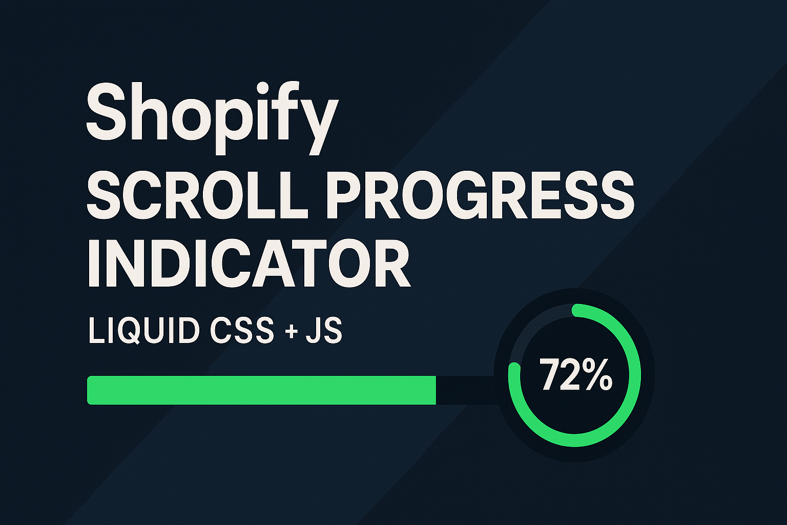
What you’ll build
- Top progress bar that fills as the page (or article) is scrolled
- Floating circular progress button (bottom-right) that doubles as Back to top
- Reading progress mode that tracks a specific container (e.g., your blog post)
- Reduced-motion safe, keyboard accessible, and lightweight
Where to paste in Shopify
- Online Store → Themes → Customize
- Open your target template (Home, Blog post, Article, etc.)
- Add section → Custom HTML (or Custom Liquid)
- Paste the entire snippet below → Save
This is an example for learning and quick use. Later you can port it into a Liquid section with schema if you want editor controls.
Copy-Paste Example — Scroll Progress Indicator
Paste everything from <!DOCTYPE html> to </html>.
DESIGNED FOR REFERENCE ONLY
<body>


  <meta charset="UTF-8">
  <meta name="viewport" content="width=device-width, initial-scale=1.0">
  <title>Shopify Scroll Progress Indicator</title>
  <style>
    :root{
      /* BRAND TWEAKS */
      --sp-accent: #00d084;     /* progress color */
      --sp-track:  rgba(255,255,255,.18);
      --sp-text:   #e8ecf1;
      --sp-bg:     #0f1115;

      /* LAYOUT */
      --sp-bar-h: 4px;          /* top bar thickness */
      --sp-btn-size: 48px;      /* floating button diameter */
      --sp-btn-offset: 18px;    /* distance from edges */

      /* FX */
      --sp-shadow: 0 12px 36px rgba(0,0,0,.28);
      --sp-z: 99999;
      --sp-trans: 180ms ease;
    }

    html,body{ margin:0; background:#0b0d12; color:var(--sp-text); font-family: Arial, sans-serif; }

    /* DEMO CONTENT (safe to remove) */
    .container{ max-width: 900px; margin: 0 auto; padding: 28px 18px 120vh; }
    .container h1{ margin: 18px 0 10px; font-size: clamp(28px, 5.4vw, 56px); }
    .container p{ line-height: 1.65; opacity:.98; }
    .hero{ min-height: 48vh; display:grid; place-items:center; background: linear-gradient(180deg, #10131a,#0b0d12); }

    /* ===== TOP PROGRESS BAR ===== */
    .sp-bar{
      position: fixed; top: 0; left: 0; right: 0; height: var(--sp-bar-h);
      background: var(--sp-track);
      z-index: var(--sp-z);
      overflow: hidden;
      transform: translateZ(0);
    }
    .sp-bar__fill{
      height: 100%; width: 0%;
      background: var(--sp-accent);
      transition: width .06s linear;
    }

    /* ===== FLOATING CIRCULAR BUTTON (progress + back-to-top) ===== */
    .sp-fab{
      position: fixed;
      right: var(--sp-btn-offset); bottom: var(--sp-btn-offset);
      width: var(--sp-btn-size); height: var(--sp-btn-size);
      border-radius: 50%;
      background: var(--sp-bg);
      color: var(--sp-text);
      border: 1px solid #1f2636;
      display:grid; place-items:center;
      box-shadow: var(--sp-shadow);
      cursor: pointer;
      z-index: var(--sp-z);
      transition: transform var(--sp-trans), opacity var(--sp-trans);
    }
    .sp-fab[hidden]{ opacity:0; transform: translateY(10px); pointer-events:none; }

    /* Progress ring */
    .sp-ring{ position:absolute; inset:0; }
    .sp-ring svg{ width:100%; height:100%; transform: rotate(-90deg); }
    .sp-ring circle{
      fill: none;
      stroke: var(--sp-track);
      stroke-width: 6;
    }
    .sp-ring circle.sp-ring__bar{
      stroke: var(--sp-accent);
      stroke-linecap: round;
      stroke-dasharray: 0 1;      /* JS sets real values */
      transition: stroke-dasharray .06s linear;
    }

    .sp-fab__label{
      position: relative; z-index: 1;
      font-size: 12px; font-weight: 800; letter-spacing:.3px;
      user-select: none;
    }

    /* Small screens: tuck the fab closer in */
    @media (max-width: 520px){
      :root{ --sp-btn-size: 44px; --sp-btn-offset: 14px; }
      .sp-fab__label{ font-size: 11px; }
    }

    /* Respect reduced motion (no animation, immediate updates) */
    @media (prefers-reduced-motion: reduce){
      .sp-bar__fill, .sp-ring circle.sp-ring__bar{ transition: none !important; }
      .sp-fab{ transition: none !important; }
    }
  </style>


  <!-- TOP PROGRESS BAR -->
  <div class="sp-bar" id="spBar" aria-hidden="true">
    <div class="sp-bar__fill" id="spBarFill"></div>
  </div>

  <!-- FLOATING CIRCULAR PROGRESS / BACK TO TOP -->
  <button class="sp-fab" id="spFab" aria-label="Back to top">
    <span class="sp-fab__label" id="spPct">0%</span>
    <div class="sp-ring" aria-hidden="true">
      <svg viewbox="0 0 100 100">
        <circle cx="50" cy="50" r="44"></circle>
        <circle class="sp-ring__bar" id="spRingBar" cx="50" cy="50" r="44"></circle>
      </svg>
    </div>
  </button>

  <!-- DEMO: Article container for "reading progress" -->
  <section class="hero"><h2>Scroll to see progress</h2></section>
  <article class="container" id="article">
    <h1>Example Article: Reading Progress</h1>
    <p>Paste this whole snippet into a Custom HTML/Liquid block. The progress can track the entire page or just this article container. Replace this content with your blog post body.</p>
    <p>Lorem ipsum dolor sit amet, consectetur adipiscing elit. Donec ultricies, lorem id pellentesque convallis, arcu ante rhoncus nisl, at condimentum est arcu vitae eros...</p>
    <p>Keep adding paragraphs to test. On long pages, the floating button appears after a small scroll and shows your progress as a percentage. Click it to jump back to the top smoothly.</p>
    <p>Tip: If your theme already has a sticky header, the thin top bar will sit above everything using a very high z-index. Adjust if necessary.</p>
    <p>Accessibility: We honor `prefers-reduced-motion`, remove animations, and still update progress instantly.</p>
    <p style="margin-bottom:60vh">Spacer lines so you can scroll comfortably and watch the indicator fill up…</p>
  </article>

  <script>
    (function(){
      // CONFIG
      const trackContainer = document.getElementById('article'); // reading progress container
      const useReadingProgress = true; // set to false to track full page

      const bar = document.getElementById('spBarFill');
      const fab = document.getElementById('spFab');
      const pct = document.getElementById('spPct');
      const ring = document.getElementById('spRingBar');

      if(!bar || !fab || !pct || !ring) return;

      const prefersReduced = window.matchMedia && window.matchMedia('(prefers-reduced-motion: reduce)').matches;

      // Prepare ring metrics
      const R = 44; // r attribute in SVG
      const CIRC = 2 * Math.PI * R;
      ring.style.strokeDasharray = `${0} ${CIRC}`;

      // Show FAB after some scroll (e.g., 120px)
      const showAfter = 120;

      // Compute progress 0..1
      function progress(){
        if(useReadingProgress && trackContainer){
          const rect = trackContainer.getBoundingClientRect();
          const vh = window.innerHeight || document.documentElement.clientHeight;
          const total = rect.height - vh;
          const scrolled = Math.min(Math.max(vh - Math.max(0, rect.top), 0), rect.height);
          return total > 0 ? Math.min(Math.max(scrolled / total, 0), 1) : 1;
        } else {
          const y = window.scrollY || window.pageYOffset || 0;
          const h = document.documentElement.scrollHeight - window.innerHeight;
          return h > 0 ? Math.min(Math.max(y / h, 0), 1) : 1;
        }
      }

      function update(){
        const p = progress();
        const pctVal = Math.round(p * 100);

        // Top bar
        bar.style.width = (pctVal) + '%';

        // FAB progress ring and label
        const filled = (CIRC * p);
        ring.style.strokeDasharray = `${filled} ${CIRC - filled}`;
        pct.textContent = pctVal + '%';

        // Show/hide FAB
        const y = window.scrollY || window.pageYOffset || 0;
        if(y > showAfter){ fab.hidden = false; } else { fab.hidden = true; }
      }

      // Events
      window.addEventListener('scroll', update, {passive:true});
      window.addEventListener('resize', update, {passive:true});
      window.addEventListener('orientationchange', update, {passive:true});
      window.addEventListener('load', update);

      // Click → Back to top (smooth)
      fab.addEventListener('click', () => {
        if(prefersReduced){
          window.scrollTo(0,0);
        } else {
          window.scrollTo({ top: 0, behavior: 'smooth' });
        }
      });
    })();
  </script>

</body>
Customize it fast
- Track full page vs. article:
- Set useReadingProgress = false to track the whole page.
- Leave true to track a specific container (#article); change the ID to your blog content wrapper.
- Colors & sizes: tweak --sp-accent, --sp-track, --sp-bar-h, --sp-btn-size.
- Show threshold: change showAfter (px) to reveal the button earlier/later.
- Placement: move the FAB by editing --sp-btn-offset (or swap right/left).
- Accessibility: prefers-reduced-motion disables animations but keeps progress accurate.
Troubleshooting
- Progress stuck at 0% → Ensure the page is long enough to scroll; if using reading mode, your container must be taller than the viewport.
- FAB behind other elements → Increase --sp-z.
- Theme has its own progress/scroll JS → Keep just one system to avoid conflicts.
- Header overlaps the top bar → It’s intended to sit above; if you want it under, lower --sp-z.


