
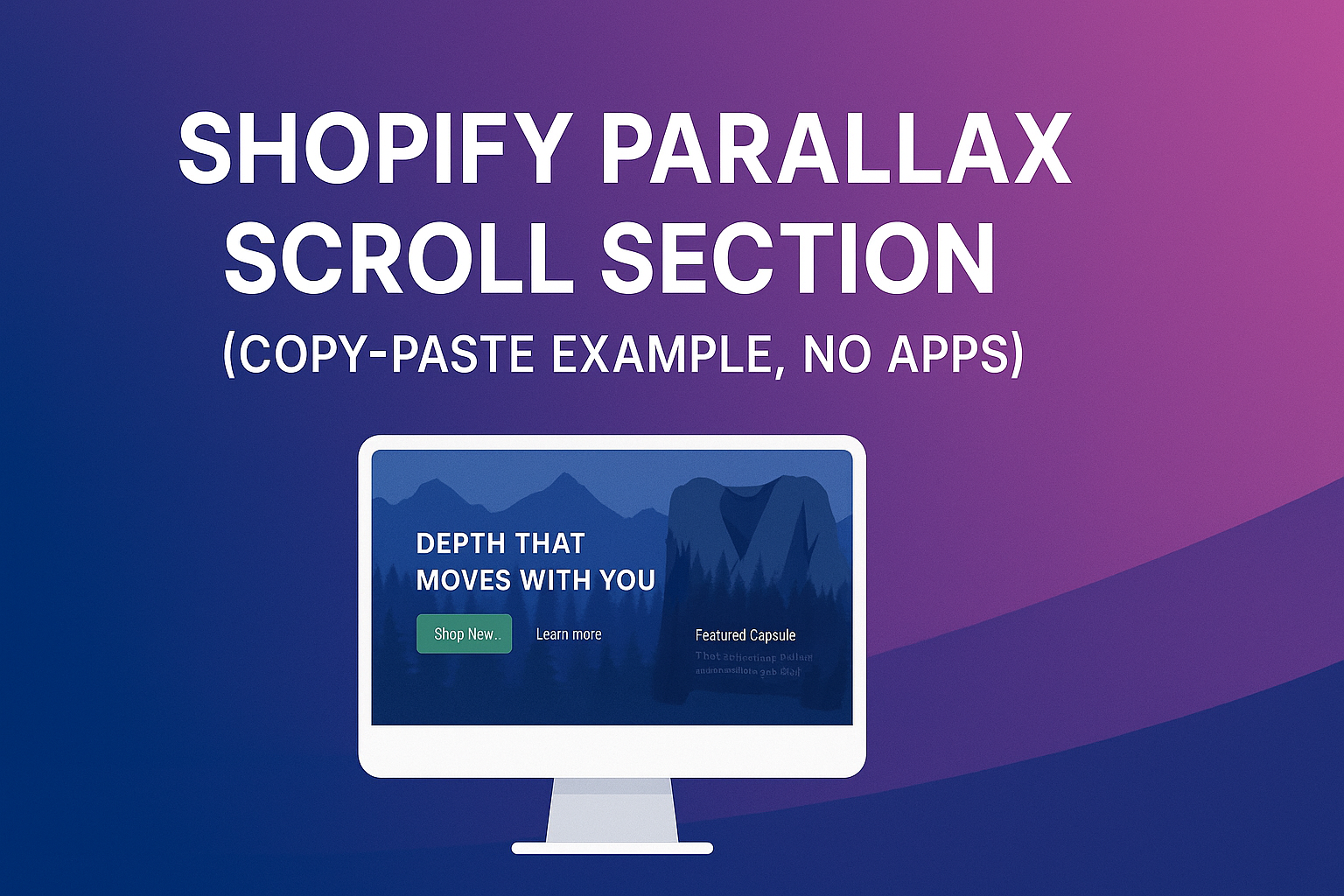
Parallax adds depth and motion to your hero/feature sections: foreground content moves at normal speed while background layers drift more slowly, creating a premium, cinematic feel. Below you’ll find alightweight parallax sectionthat usespure HTML, CSS, and a tiny JS helper—no apps, no frameworks, no Liquid. Paste it into a Custom HTML/Liquid block, swap in your assets, and tune the speeds. This is anexamplefor learning and quick shipping; you can later convert it into a Liquid section with schema fields if you need editor controls.
<body>


  <meta charset="UTF-8">
  <meta name="viewport" content="width=device-width, initial-scale=1.0">
  <title>Shopify Parallax Scroll Section</title>
  <style>
    /* ===== Brand tokens (tweak for your store) ===== */
    :root{
      --px-bg: #0f1115;
      --px-fg: #e8ecf1;
      --px-accent: #00d084;
      --px-height: 86vh;         /* section height on desktop */
      --px-height-m: 72vh;       /* section height on mobile */
      --px-radius: 18px;
      --px-shadow: 0 24px 60px rgba(0,0,0,.35);
      --px-overlay: rgba(10,12,18,.35); /* darken for text readability */
    }

    html,body{ margin:0; background:var(--px-bg); color:var(--px-fg); font-family: Arial, sans-serif; }
    .px-section{
      position: relative;
      min-height: var(--px-height);
      overflow: clip;           /* keeps transforms neatly clipped */
      display: grid;
      place-items: center;
      isolation: isolate;       /* stack context so z-index behaves */
    }

    /* Parallax stage */
    .px-stage{
      position: absolute; inset: 0;
      perspective: 1200px; /* not required, but helps for subtle depth if you add 3D later */
    }

    /* Generic parallax layer */
    .px-layer{
      position: absolute; inset: -6%; /* bleed to avoid edges during transforms */
      background-size: cover;
      background-position: center;
      will-change: transform;
      transform: translate3d(0,0,0);
      z-index: 0;
    }

    /* Example images: replace with your Shopify CDN URLs */
    .px-far  { background-image: url('https://picsum.photos/id/1056/2000/1200'); filter: saturate(.85) brightness(.9) contrast(1.05); }
    .px-mid  { background-image: url('https://picsum.photos/id/1018/2000/1200'); mix-blend-mode: normal; opacity: .85; }
    .px-near { background-image: url('https://picsum.photos/id/1003/2000/1200'); opacity: .9; }

    /* Overlay for legible text */
    .px-overlay{
      position:absolute; inset:0; background: var(--px-overlay); z-index: 1;
    }

    /* Foreground content */
    .px-content{
      position: relative; z-index: 2;
      max-width: 1100px; width: min(92vw, 1100px);
      margin: 0 auto;
      display: grid;
      grid-template-columns: 1.1fr .9fr;
      gap: clamp(16px, 3vw, 28px);
      align-items: center;
      padding: clamp(16px, 4vw, 30px);
      border-radius: var(--px-radius);
    }

    .px-copy h1{
      margin:0 0 8px; font-size: clamp(28px, 5.6vw, 56px); line-height: 1.04; letter-spacing:.2px; font-weight: 900;
    }
    .px-copy p{
      margin:0 0 18px; font-size: clamp(14px, 2.2vw, 18px); opacity:.95; max-width: 65ch;
    }
    .px-ctas{ display:flex; gap:12px; flex-wrap:wrap; }
    .btn{
      appearance:none; border:0; border-radius:12px; padding:12px 16px; font-weight:800; cursor:pointer;
      background: var(--px-accent); color:#0f1115;
    }
    .btn--ghost{
      background: transparent; color: var(--px-fg); border:1px solid #273149;
    }

    .px-card{
      background: #151924; color:#e8ecf1; border:1px solid #1f2636;
      border-radius: 16px; box-shadow: var(--px-shadow); overflow:hidden;
    }
    .px-card img{ width:100%; height: 220px; object-fit: cover; display:block; }
    .px-card .pad{ padding: 14px; }
    .px-card h3{ margin: 6px 0 8px; font-size: 18px; }
    .px-card p{ margin:0; font-size:14px; opacity:.9; }

    /* Make the whole thing look nice below */
    .px-spacer{ height: 100vh; background: linear-gradient(180deg, #0f1115, #0b0d12); }

    /* Mobile adjustments */
    @media (max-width: 980px){
      :root{ --px-height: var(--px-height-m); }
      .px-content{ grid-template-columns: 1fr; }
      .px-card img{ height: 200px; }
    }

    /* Reduced motion: disable transforms */
    @media (prefers-reduced-motion: reduce){
      .px-layer{ transform: none !important; }
    }
  </style>


  <!-- PARALLAX SECTION -->
  <section class="px-section" id="pxSection" data-parallax data-speed-far="0.15" data-speed-mid="0.35" data-speed-near="0.6" data-mobile-intensity="0.4" multiplier on mobile>
           data-max-shift="120">         <!-- clamp transform in px -->
    <div class="px-stage" aria-hidden="true">
      <div class="px-layer px-far" data-layer="far"></div>
      <div class="px-layer px-mid" data-layer="mid"></div>
      <div class="px-layer px-near" data-layer="near"></div>
    </div>
    <div class="px-overlay" aria-hidden="true"></div>

    <div class="px-content">
      <div class="px-copy">
        <h1>Depth that Moves With You</h1>
        <p>Create cinematic parallax without apps. Lightweight transforms, smooth on modern devices, and safe for users who prefer reduced motion.</p>
        <div class="px-ctas">
          <button class="btn" onclick="window.location.href='/collections/all'">Shop New</button>
          <button class="btn btn--ghost" onclick="window.location.href='/pages/about'">Learn More</button>
        </div>
      </div>
      <div class="px-card">
        <img src="https://picsum.photos/id/1044/1200/800" alt="Feature image">
        <div class="pad">
          <h3>Featured Capsule</h3>
          <p>Textures, layers, and timeless silhouettes designed for movement.</p>
        </div>
      </div>
    </div>
  </section>

  <!-- Just to demonstrate scrolling past the section -->
  <div class="px-spacer"></div>

  <script>
    (function(){
      const section = document.querySelector('[data-parallax]');
      if(!section) return;

      const far  = section.querySelector('[data-layer="far"]');
      const mid  = section.querySelector('[data-layer="mid"]');
      const near = section.querySelector('[data-layer="near"]');

      const speed = {
        far:  parseFloat(section.getAttribute('data-speed-far'))  || 0.15,
        mid:  parseFloat(section.getAttribute('data-speed-mid'))  || 0.35,
        near: parseFloat(section.getAttribute('data-speed-near')) || 0.6,
      };
      const maxShift = parseFloat(section.getAttribute('data-max-shift')) || 120;
      const mobileIntensity = Math.min(Math.max(parseFloat(section.getAttribute('data-mobile-intensity') || '0.4'), 0), 1);

      const prefersReduced = window.matchMedia && window.matchMedia('(prefers-reduced-motion: reduce)').matches;
      if(prefersReduced){ return; }

      let width = window.innerWidth;
      function factor(){ return width < 980 ? mobileIntensity : 1; }

      function clamp(n, min, max){ return Math.max(min, Math.min(n, max)); }

      function tick(){
        const rect = section.getBoundingClientRect();
        const vh = window.innerHeight || document.documentElement.clientHeight;

        // progress: how far the section is through the viewport (-1 off top, 0 enters, 1 centered, 2 leaving)
        const center = rect.top + rect.height/2 - vh/2;
        const norm = clamp(center / (vh/2), -2, 2);

        const mult = factor();

        // translate each layer: negative norm moves up as you scroll down
        const tFar  = clamp(-norm * (speed.far  * 100) * mult, -maxShift, maxShift);
        const tMid  = clamp(-norm * (speed.mid  * 100) * mult, -maxShift, maxShift);
        const tNear = clamp(-norm * (speed.near * 100) * mult, -maxShift, maxShift);

        if(far)  far.style.transform  = 'translate3d(0,' + tFar  + 'px,0)';
        if(mid)  mid.style.transform  = 'translate3d(0,' + tMid  + 'px,0)';
        if(near) near.style.transform = 'translate3d(0,' + tNear + 'px,0)';

        // request next frame during scroll
        raf = requestAnimationFrame(tick);
      }

      // Use a tiny rAF loop only while the section is near the viewport
      let raf = null;
      const io = 'IntersectionObserver' in window ? new IntersectionObserver((entries)=>{
        entries.forEach(entry=>{
          if(entry.isIntersecting){
            if(!raf){ raf = requestAnimationFrame(tick); }
          }else{
            if(raf){ cancelAnimationFrame(raf); raf = null; }
          }
        });
      }, { root: null, rootMargin: '200px 0px 200px 0px' }) : null;

      if(io){ io.observe(section); }
      else { raf = requestAnimationFrame(tick); } // fallback

      window.addEventListener('resize', () => { width = window.innerWidth; }, {passive:true});
    })();
  </script>

</body>
How it works (quick)
- HTML: A .px-stage holds three .px-layer divs—far, mid, and near—plus an overlay for readability and a .px-content grid on top.
- CSS: Each layer is absolutely positioned and slightly “bleeds” beyond the edges so transforms never reveal gaps. Only transform is animated (GPU-friendly).
- JS: For the section, we compute a normalized scroll value and translate each layer by different amounts. IntersectionObserver starts/stops a small requestAnimationFrame loop only when the section is near the viewport (extra performance). Mobile intensity is reduced via a multiplier, and prefers-reduced-motion disables transforms entirely.
Customize fast
- Images: replace the three background-image URLs on .px-far, .px-mid, .px-near.
- Speeds: tune data-speed-far/mid/near (0.1–0.8 is a good range).
- Max shift: cap motion with data-max-shift (in px; try 80–160).
- Mobile intensity: data-mobile-intensity="0.3" to tame the effect on phones.
- Height: set --px-height and --px-height-m.
- Overlay strength: edit --px-overlay (e.g., rgba(0,0,0,.45)) for text contrast.
- Layout: change .px-content grid or swap the right card for a product slider, UGC strip, etc.
Best practices
- Keep transforms modest (≤120px) to avoid motion sickness.
- Optimize images (JPG/WebP; 1600–2000px wide is usually enough).
- Respect reduced motion (already baked in).
- Avoid heavy scroll listeners; this pattern uses a small rAF loop only when visible.
- Test against sticky headers; if your header overlaps, add top padding or reduce section height.
Turning this into a Liquid Section (later)
This post uses pure HTML/CSS/JS so anyone can paste it. If you want theme-editor controls, create /sections/parallax-scroll.liquid, move the markup there, and add a JSON schema with settings for the three images, speeds, height, overlay, and copy fields. The parallax logic and classes stay the same—only the content source changes.


