
—
In Shopify you can build a horizontal scroller without apps and without touching Liquid by using a pure HTML/CSS/JSsnippet. This post gives you a production-ready example that supports:
- Smooth horizontal scroll with CSS scroll-snap
- Drag to scroll (desktop + touch)
- Wheel to horizontal (shift vertical wheel into horizontal)
- Prev/Next buttons with disabled states
- Keyboard arrows for accessibility
- Snap alignment and progress bar
- Clean, responsive layout with card items
It’s the same style as our previous tutorials: a full <!DOCTYPE html> block you can paste into a Custom HTML or Custom Liquid section. This is just an example — swap images, copy, and colors as you like.
Where to paste this in Shopify
- Online Store → Themes → Customize
- Open the page/template you want (Home is typical)
- Add section → Custom HTML (or Custom Liquid)
- Paste the full snippet below
- Save and preview
Tip: Place it below your hero or above “Featured collection” to maximize impact.
Copy-Paste Example — Horizontal Scroll Section
Paste everything from <!DOCTYPE html> to </html>.
<body>
<meta charset="UTF-8">
<meta name="viewport" content="width=device-width, initial-scale=1.0">
<title>Shopify Horizontal Scroll Section</title>
<style>
:root{
/* Tweak these to match your brand */
--hs-bg: #0f1115;
--hs-fg: #ffffff;
--hs-accent: #00d084;
--hs-card-bg: #151924;
--hs-card-fg: #e8ecf1;
--hs-gap: 16px;
--hs-radius: 12px;
--hs-card-w: 260px;
--hs-card-h: 320px;
--hs-pad: 20px;
--hs-progress: #3aa7ff;
}
body{ margin:0; font-family: Arial, sans-serif; background:#0b0d12; color:#e8ecf1; }
.hs-section{
background: var(--hs-bg);
color: var(--hs-fg);
padding: 36px var(--hs-pad);
}
.hs-header{
display:flex; align-items:center; justify-content:space-between; gap:12px;
margin-bottom:16px;
}
.hs-title{ font-size: 22px; font-weight: 800; letter-spacing: .2px; }
.hs-cta-row{ display:flex; align-items:center; gap:8px; }
.hs-btn{
appearance:none; border:0; border-radius:10px; padding:10px 12px;
background:#1b2030; color:#cfd7e3; cursor:pointer; font-weight:700;
transition: transform .08s ease, opacity .2s ease, background .2s ease;
}
.hs-btn:active{ transform: translateY(1px); }
.hs-btn[disabled]{ opacity:.35; cursor:not-allowed; }
.hs-btn--accent{ background: var(--hs-accent); color:#0f1115; }
.hs-viewport{
position: relative;
}
/* The horizontal scroller */
.hs-track{
display: grid;
grid-auto-flow: column;
grid-auto-columns: var(--hs-card-w);
gap: var(--hs-gap);
overflow-x: auto;
overflow-y: hidden;
scroll-snap-type: x mandatory;
scroll-behavior: smooth;
padding-bottom: 6px; /* leave room for focus ring */
scrollbar-width: none; /* Firefox hide */
}
.hs-track::-webkit-scrollbar{ display:none; } /* Chrome hide */
.hs-card{
scroll-snap-align: start;
height: var(--hs-card-h);
border-radius: var(--hs-radius);
background: var(--hs-card-bg);
color: var(--hs-card-fg);
position: relative;
overflow: hidden;
display:flex; flex-direction:column;
}
.hs-img{
width:100%; height: 62%;
object-fit: cover; display:block;
}
.hs-card-body{
flex:1; display:flex; flex-direction:column; justify-content:center;
padding:12px;
gap:6px;
}
.hs-card-title{ font-weight:800; font-size:15px; }
.hs-card-sub{ font-size:13px; color:#aeb8c6; }
.hs-card a{
color: inherit; text-decoration: none;
}
/* Progress bar */
.hs-progress{
height: 4px; background: #1b2030; border-radius: 999px; margin-top: 14px;
overflow:hidden;
}
.hs-progress__bar{
height:100%; width:0%; background: var(--hs-progress);
transition: width .2s ease;
}
/* Drag helper cursor */
.hs-track.grabbing{ cursor: grabbing; }
.hs-track.grab{ cursor: grab; }
/* Responsive tweaks */
@media (max-width: 740px){
:root{
--hs-card-w: 74vw;
--hs-card-h: 280px;
}
.hs-title{ font-size: 20px; }
.hs-btn{ padding: 9px 10px; }
}
</style>
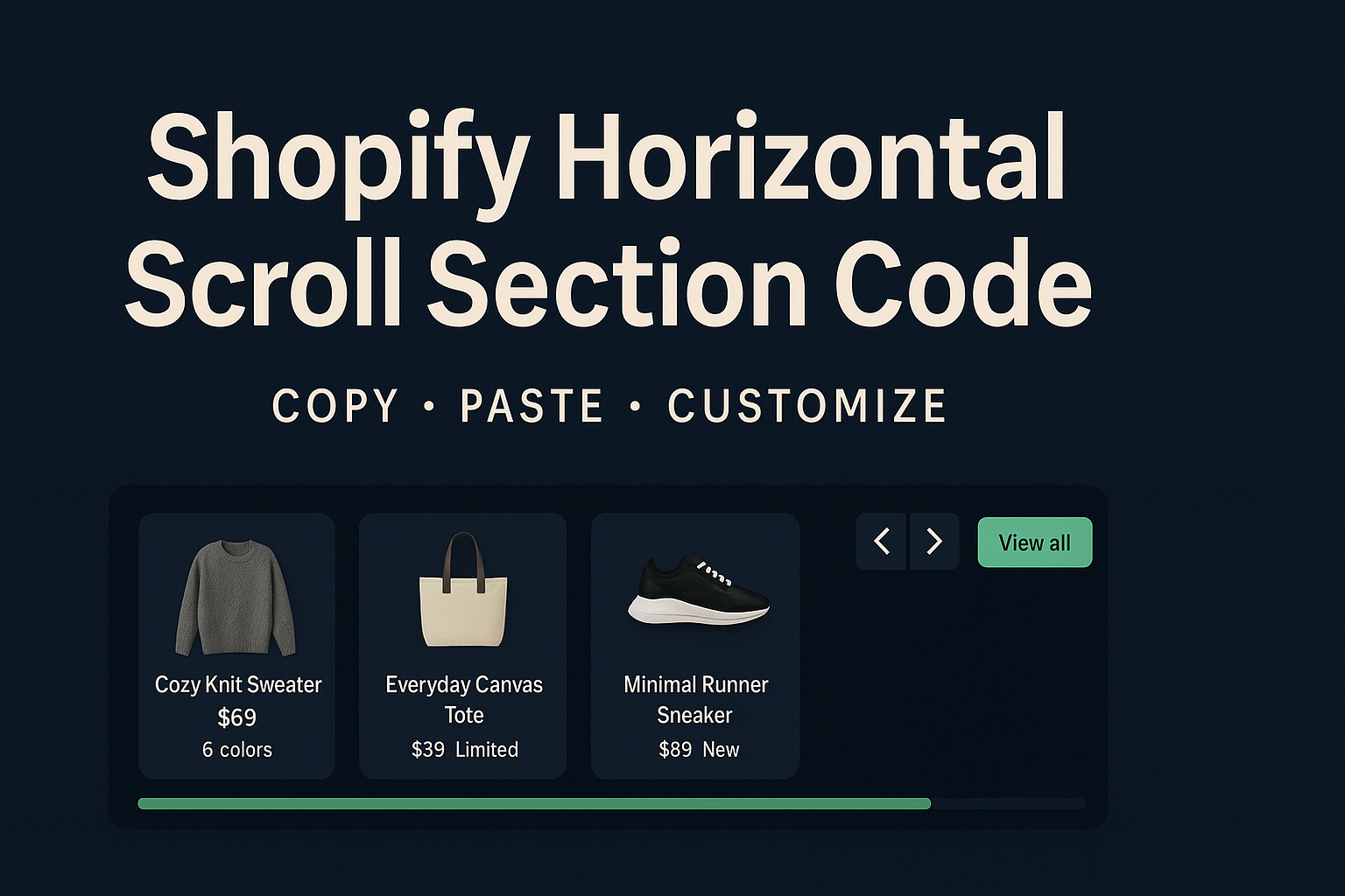
<section class="hs-section" aria-label="Horizontal products">
<header class="hs-header">
<h2 class="hs-title">New & Trending</h2>
<div class="hs-cta-row">
<button class="hs-btn" id="hsPrev" aria-label="Scroll previous">◀</button>
<button class="hs-btn" id="hsNext" aria-label="Scroll next">▶</button>
<button class="hs-btn hs-btn--accent" id="hsViewAll" aria-label="View all">View all</button>
</div>
</header>
<div class="hs-viewport">
<div class="hs-track grab" id="hsTrack" tabindex="0" aria-label="Horizontal scroll gallery">
<!-- ITEM 1 -->
<article class="hs-card">
<img class="hs-img" src="https://picsum.photos/id/1000/800/600" alt="Cozy knit sweater">
<div class="hs-card-body">
<a href="/products/example-1" class="hs-card-title">Cozy Knit Sweater</a>
<div class="hs-card-sub">$69 — 6 colors</div>
</div>
</article>
<!-- ITEM 2 -->
<article class="hs-card">
<img class="hs-img" src="https://picsum.photos/id/1005/800/600" alt="Everyday Canvas Tote">
<div class="hs-card-body">
<a href="/products/example-2" class="hs-card-title">Everyday Canvas Tote</a>
<div class="hs-card-sub">$39 — Limited</div>
</div>
</article>
<!-- ITEM 3 -->
<article class="hs-card">
<img class="hs-img" src="https://picsum.photos/id/1020/800/600" alt="Minimal Runner Sneaker">
<div class="hs-card-body">
<a href="/products/example-3" class="hs-card-title">Minimal Runner Sneaker</a>
<div class="hs-card-sub">$89 — New</div>
</div>
</article>
<!-- ITEM 4 -->
<article class="hs-card">
<img class="hs-img" src="https://picsum.photos/id/1035/800/600" alt="Packable Puffer Jacket">
<div class="hs-card-body">
<a href="/products/example-4" class="hs-card-title">Packable Puffer Jacket</a>
<div class="hs-card-sub">$129 — Warm</div>
</div>
</article>
<!-- ITEM 5 -->
<article class="hs-card">
<img class="hs-img" src="https://picsum.photos/id/1043/800/600" alt="Studio Hoodie">
<div class="hs-card-body">
<a href="/products/example-5" class="hs-card-title">Studio Hoodie</a>
<div class="hs-card-sub">$59 — Best seller</div>
</div>
</article>
<!-- ITEM 6 -->
<article class="hs-card">
<img class="hs-img" src="https://picsum.photos/id/1052/800/600" alt="Travel Duffel">
<div class="hs-card-body">
<a href="/products/example-6" class="hs-card-title">Travel Duffel</a>
<div class="hs-card-sub">$119 — New</div>
</div>
</article>
</div>
<div class="hs-progress" aria-hidden="true">
<div class="hs-progress__bar" id="hsProgress"></div>
</div>
</div>
</section>
<script>
(function(){
const track = document.getElementById('hsTrack');
const prev = document.getElementById('hsPrev');
const next = document.getElementById('hsNext');
const viewAll = document.getElementById('hsViewAll');
const progress = document.getElementById('hsProgress');
if(!track) return;
/* ----- helpers ----- */
const cardWidth = () => track.firstElementChild?.getBoundingClientRect().width || 260;
const step = () => Math.round(cardWidth() + parseFloat(getComputedStyle(track).gap || 16));
function clampButtons(){
const max = track.scrollWidth - track.clientWidth - 2;
prev.disabled = track.scrollLeft <= 2;
next.disabled = track.scrollLeft >= max;
}
function updateProgress(){
const max = track.scrollWidth - track.clientWidth;
const ratio = max > 0 ? track.scrollLeft / max : 0;
progress.style.width = (ratio * 100) + '%';
}
function scrollByStep(dir){
track.scrollBy({ left: dir * step(), behavior: 'smooth' });
}
/* ----- wheel to horizontal ----- */
track.addEventListener('wheel', (e) => {
if (Math.abs(e.deltaY) > Math.abs(e.deltaX)) {
e.preventDefault();
track.scrollLeft += e.deltaY;
}
}, { passive:false });
/* ----- drag to scroll (mouse) ----- */
let isDown = false, startX = 0, startLeft = 0, dragged = false;
track.addEventListener('mousedown', (e) => {
isDown = true; dragged = false;
track.classList.add('grabbing');
startX = e.pageX; startLeft = track.scrollLeft;
});
window.addEventListener('mousemove', (e) => {
if(!isDown) return;
const dx = e.pageX - startX;
if(Math.abs(dx) > 3) dragged = true;
track.scrollLeft = startLeft - dx;
});
window.addEventListener('mouseup', () => {
isDown = false; track.classList.remove('grabbing');
});
/* ----- touch dragging is native; this just keeps cursor hints consistent ----- */
track.addEventListener('touchstart', () => track.classList.add('grabbing'), {passive:true});
track.addEventListener('touchend', () => track.classList.remove('grabbing'), {passive:true});
/* ----- keyboard arrows ----- */
track.addEventListener('keydown', (e) => {
if(e.key === 'ArrowRight'){ e.preventDefault(); scrollByStep(+1); }
if(e.key === 'ArrowLeft'){ e.preventDefault(); scrollByStep(-1); }
});
/* ----- buttons ----- */
prev.addEventListener('click', () => scrollByStep(-1));
next.addEventListener('click', () => scrollByStep(+1));
if(viewAll){
viewAll.addEventListener('click', () => {
window.location.href = '/collections/all'; // change to your destination
});
}
/* ----- observers / events ----- */
const ro = new ResizeObserver(() => { clampButtons(); updateProgress(); });
ro.observe(track);
track.addEventListener('scroll', () => { clampButtons(); updateProgress(); }, {passive:true});
// init
clampButtons(); updateProgress();
})();
</script>
</body>How it works (quick breakdown)
- CSS scroll-snap gives smooth, predictable alignment of cards as the user releases drag or button scrolling.
- Grid with grid-auto-flow: column lets you add any number of cards without hand-coding widths.
- JavaScript adds quality-of-life features:Converts vertical mouse wheel to horizontal movement.Drag-to-scroll on desktop (touch is native).Prev/Next buttons scroll by one card “step” (card width + gap).Keyboard arrows work when the track is focused.A progress bar reflects how far you’ve scrolled.Buttons disable at the ends.
Customize it fast
- Colors: change CSS variables at the top (--hs-bg, --hs-card-bg, --hs-accent).
- Card size: tweak --hs-card-w and --hs-card-h.
- Gap: adjust --hs-gap.
- Copy/links: edit titles, subtitles, and href values.
- Images: swap the picsum.photos links with your Shopify CDN URLs.
- View All button: set the real collection URL or remove the button entirely.
- Scroll step: code calculates step size from card width + gap; hard-code a number if you want bigger jumps.
Best practices
- Optimize images (JPG/WebP; appropriate sizes) to keep scrolling silky.
- Snap-start vs. snap-center: try scroll-snap-align: center for different feel.
- Focus states: leaving tabindex="0" on the track preserves keyboard access.
- Don’t overstuff: 6–12 cards is a sweet spot before fatigue kicks in.
- Mobile first: on small screens the CSS switches cards to percentage width for better peeking affordance.
Troubleshooting
- Buttons don’t disable → Ensure there’s overflow (more cards than viewport); otherwise both ends are “maxed”.
- Drag isn’t working → You may be dragging on an image link; try dragging between cards, or keep drag even if link clicks (this snippet allows drag without blocking links unless you move significantly).
- Jittery wheel → Remove/adjust the wheel handler if your theme already remaps wheel events.
- Progress bar stuck at 0 → Check that the track actually overflows horizontally (increase number of cards or reduce card width).
Final notes
This horizontal scroll section is a flexible, no-app pattern you can re-use for featured products, lookbooks, brand logos, or blog highlights. Because it’s pure HTML/CSS/JS, it pastes cleanly into Shopify’s Custom HTML/Liquid blocks and won’t trigger Liquid syntax errors. Treat it as an example: adjust colors, images, and destinations, or later port it into a theme section with schema if you want configurable settings in the editor.


